A teardown sounds bad. Malicious even. Images come to mind of a well-researched exposé inflicting irreparable reputational harm. Or at least a conspiracy theorist doing conspiracy theory things.

Maybe that’s some kind of teardown, but not this kind. This kind isn’t negative, or at least maliciously so.
Rather, the goal is to take the view of a user and unpack the product and design choices the developer made in building a software experience.
What messages do they want prospective users to see? What information do they require to sign-up? Do they offer a free trial, and if so, how long? What features do they steer me toward in-app? Like a tree, every answer branches off in a new direction, leading to another layer of questions.
…Which brings me to today.
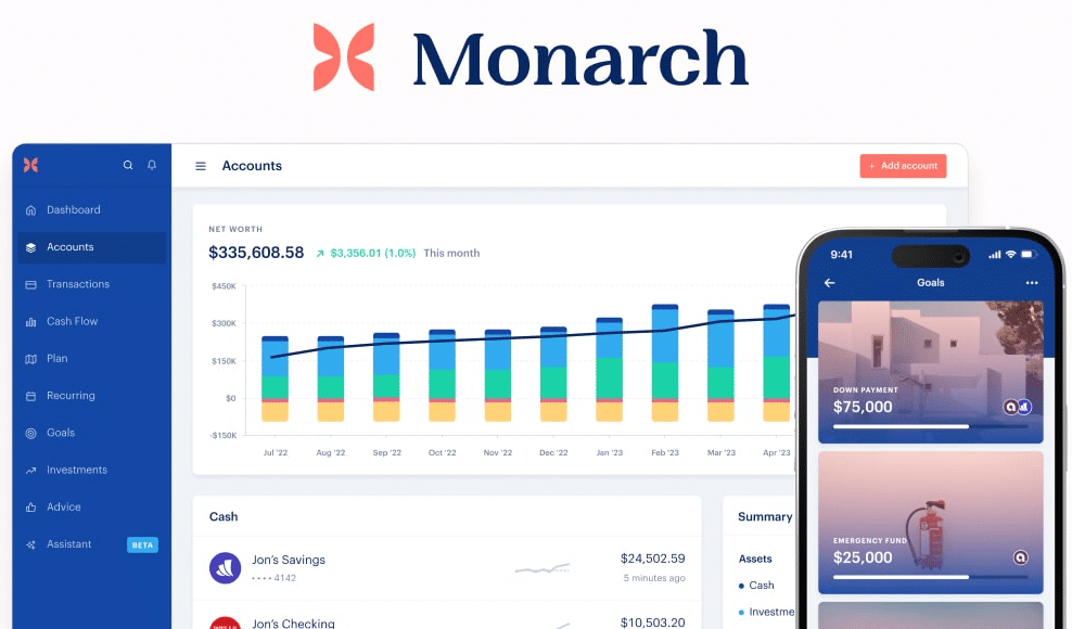
This is the first in a series of fresh-eyed deep dives into tech products I try and use. Today I’ll focus on the sign-up and onboarding flows for Monarch Money, a personal finance app for tracking net worth, budgeting, and getting a “complete picture of your finances”.
Context: My background and research
A bit about my mindset going in: I’ve been a personal finance nerd for as long as I can remember, so having a live dashboard of all money-in and money-out is a longtime goal. I’ve spent more time than I care to admit researching and comparing credit card benefits. I’ve built spreadsheets to track and project income, expenses, and net worth. And I’ve used and enjoyed free apps like Personal Capital (AKA Empower) and Mint over the years. But with these apps, I never felt our incentives were perfectly aligned: since they were free, I was the product, or so the narrative goes.
So with this long-held interest and a healthy skepticism of free software, I was thrilled to see subscription-based finance apps gain traction in 2023 and onwards.
Monarch. Copilot. You Need A Budget. Simplifi. Rocket Money. The visions are often similar: for a job as important as your finances, you’re better off paying with your wallet than paying the indirect costs of using free software.
Most of these paid offerings were priced in the range of $100 per year, which I’d gladly pay for a solution that fit my needs. But what exactly would this require?
In a great personal finance app, I’m mainly looking for an accurate, up-to-date view of my net worth, integrated with each of my accounts — checking, savings, brokerage, etc — in a robust way that doesn’t require constant maintenance to keep them connected. With other apps like Personal Capital, it felt like every time I opened the app I needed to reconnect a credit card or 401k account that had gone stale. Eventually, even opening the app feels like a chore.
Secondary benefits include the ability to view and categorize transactions (though I don’t do this today) and see summary views of my finances at the monthly and yearly level.
So then why Monarch?
After some light research, I narrowed the list down to Monarch Money and Copilot. While there were many great alternatives, these two seemed more attuned to ‘at-a-glance’ net worth tracking than transaction-level budgeting, which aligned better with my goals and tolerance for hassle. From there, it was close:
- Monarch and Copilot both were highly usable and simple to setup
- Based on several ‘best-of’ lists like this, both were leaders in this emerging category of paid-personal-finance apps.
- Both made similar promises in their marketing: view your net worth, manage a budget, and take control of your financial future.
- And strangely enough, they had nearly identical reviews in the iOS app store when I was deciding – 4.9 stars from ~9,000 reviews (Monarch has since grown faster over the last year).
So it was close. But a few friends I trusted were already using Monarch, and I liked its branding and UI. It felt lighter, friendlier, more approachable.
What sold me was that Monarch hyped up its account integration and connectivity, one of my few must-haves. In fact, the primary two decision factors I considered were connectivity and price. Monarch checked each of these boxes, had great reviews, and a clean user experience. I decided to give it a go.
So with a decision made, let’s teardown their sign-up and onboarding.
Sign-up Flow
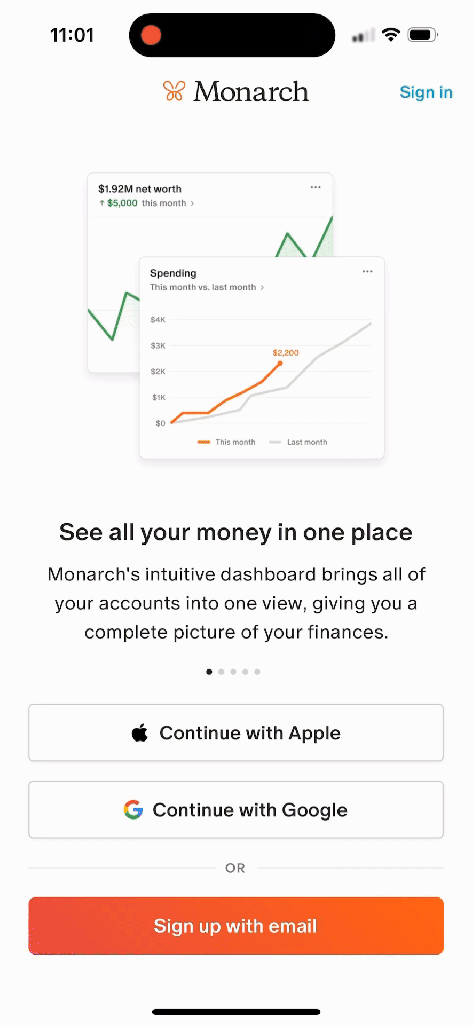
We start at the sign-up screen, where Monarch presents a carousel with 5 value props.
- “See all your money in one place” – love it. The one feature I need. The subhead “giving you a complete picture of your finances” resonates well and is exactly what I’m looking for.
- “Make the most of your cash flow” – Analyzing our monthly spending and saving habits isn’t the reason I’m trying the app, but it’s something I may explore later. I’d like to better track our monthly spending, but manually categorizing every transaction is too much hassle. I’m curious (though skeptical) of how accurately Monarch’s AI can categorize things automatically.
- “See into your financial future” – new and intriguing; not something I’d thought about previously. I like the promise of setting financial goals and planning our finances to ladder up to those goals. Making a mental note to check this out another time.
- “Keep the big picture in view” – As a first-time reader, this language doesn’t resonate and sounds too similar to the prior value prop. Here: “Track your goals and create a budget to achieve them“, vs on slide #3 “Use Monarch to predict when you’ll hit your goals, and see how changes to your budget affect your finances over time.” I’m frankly not sure what the difference is. Instead, I would have appreciated a slide on account connectivity.
- “No ads, always private and secure” — this is important to me. With free finance apps, I always assumed the worst: that my data was being sold to the highest bidder. I’d rather pay a subscription for a great UX than see ads for affiliate offers or financial managers. And with data as sensitive as finances, I’m willing to pay for better data security. Maybe this slide could even go a step further and directly assert that Monarch’s incentives are aligned with mine for this very reason.
Sign up with email.
I tap the big orange button and move forward without issues. But I’m also surprised I can’t sign up with a phone number. It’s so much faster to get a verification code text and have iOS auto-populate it. For a mobile-first app in today’s age, I’ve come to expect that.
However, the email code at least arrives quickly. The small things matter.
What brings you to Monarch?


After email verification, we’ve got a pretty standard ‘get-to-know-me’ onboarding flow.
The first item “view all of my finances in one place” is exactly what I want to do. I check that along with “Manage my money with a partner” and “track my investments“. The ‘partner’ item is especially intriguing; I assumed my wife and I would share a single login, but if Monarch has features tailored toward couples with shared finances, even better.
As a Product Manager, I like that tapping “something else” lets me type in free text so Monarch can better understand other jobs-to-be-done that users might expect from the app and thus inform the product roadmap.
How did you hear about Monarch?
Here, Monarch follows logic that Opal and others have popularized: the best way to find out how acquisition efforts are performing is just to ask [1]. I select “article or blog” and moved on.
Tell us about yourself


Pretty standard information to request, but the order of operations is well done. I like that Monarch asks about my financial priorities before this “Tell us about yourself” form; I now feel more invested and likely to move forward.

How your free trial works
This is my favorite screen in the whole onboarding flow.
Monarch is following the Blinkist playbook (among many others) of showing a maximally-clear visual timeline of the free trial, including a reminder email to reduce the fear of a rogue subscription charging me without my knowledge. For me, this goes a long way to build trust. And I like the top banner carousel that rotates between “Featured in X” and “4.8 stars” to drive home the message that this is THE personal finance app I want.
However, I definitely want to use the Mint switcher promo code, and I don’t see any field to enter it. I’m not sure if this is purposefully hidden, but it’s a blocker. So I pause at this screen.
At this stage, Monarch confuses me. I receive an email saying “Thanks for joining us!” and “Welcome to your Monarch trial!“. I haven’t started the trial yet, so I double check in iOS Settings that I didn’t accidentally subscribe. Not great.
Now confused, I ditch the phone and open my laptop. Once I log in via the browser, and click on a marketing CTA featuring the promo code, Monarch takes me to subscription check-out and pre-applies the promo code. I’m through, but I can imagine some percentage of users quitting here in frustration.
Onboarding & Account Connection
After subscribing with the promo code, I switch back to the iOS app.
Since I didn’t categorize or monitor my transactions on Mint, I forgo importing Mint data via spreadsheet and instead manually add accounts. However, I like that importing is an option, and I wonder how effective it is.

The only available action is “Add account“; everything else is locked. I appreciate how direct Monarch is here to nudge me along the intended flow. Why even allow the user to venture anywhere else if there’s no data to view yet?


First, I try to add our checking account. The flow seems easy, and I like that Monarch touts backup connection methods if the primary method fails.
Despite this perception, I go 0 / 2 on connecting my checking & brokerage accounts. It’s frustrating, and I’m now questioning the effectiveness of the purported backup methods.
I’m not sure what changed, but a few attempts later Monarch successfully connects to both my checking account and brokerage account. The flow is fast and easy when successful, using Plaid, Finicity, and other connection tools to access account data. And the brief animation (below) drives home this celebratory message, a well-placed touch of gamification.

From here, I keep at it and connect 16 accounts: checking, brokerage, 401ks, HSA, credit cards, student loan, and others.
This takes an hour between fetching login information, doing two-factor authentication, and several false starts. But rather than faulting Monarch, I think this highlights how disjointed our digital selves are. You’d think a cross-internet, immutable digital ID would have become the norm a decade ago, yet most of us still tape together dozens of usernames, passwords, verification codes, and security questions into a digital identity, which makes aggregation a pain.
Takeaways
That’s it for Monarch’s sign-up and onboarding, though I may share more about long-term use in a follow-up post.
A few months in, I’m impressed by Monarch and plan to keep the subscription.
The signup flow was fast and easy. Each screen and requested field had a purpose and there wasn’t much excess friction in the flow.
I also love that Monarch has several methods of connecting to each account to minimize disruptions. Over several months of use, only one account gets disconnected, and I blame that more on the account provider than Monarch. Most weeks I can open the app once, click “Refresh all”, and within a minute see exactly where we sit.
The UI is simple and clean while still packing a variety of features — long term goals, recurring expense tracking, monthly reviews, budgets, categories — most of which I still have yet to explore. Lots to learn here!
And most importantly, I feel our incentives are aligned. Neither my inbox nor mailbox are stuffed full of credit card offers; I haven’t gotten calls from financial managers contracting with Monarch, and (to my knowledge) my transaction-level data is secure.
Lessons learned:
- Every brand interaction is an opportunity: Software customers are won and lost for reasons that aren’t always clear to the developer, and sometimes even to the customer. I still can’t fully articulate why I first tried Monarch over Copilot or other apps, meaning that every interaction with the brand and product is significant. As a product manager, this makes clear the importance of spending deep time in our own products to understand the holistic, end-to-end experience instead of getting caught up in launching individual features.
- Transparency pays: I love how Monarch showed me a visual timeline during sign-up, with milestones denoting when the free trial ends, when I’ll be charged, and how far in advance they’ll remind me. Not only does this reduce fear and increase the chance I sign-up, but it bolsters my perception that Monarch is an honest company keeping my best interest in mind. I expect (and hope) I’ll get a similar reminder email before my Year 2 subscription charges.
- Keep the main thing the main thing: It bears repeating that the accurate, up-to-date snapshot view is 90% of the value I derive from Monarch, which relies on proper account connectivity. Monarch does this well, I get the value I’m looking for, and as a result I’m more than happy to pay.
If you read this far, my sincere gratitude. I’d love your thoughts on Monarch broadly or reactions to this post.
And if you enjoyed this teardown and want to try Monarch yourself, you can use this referral code (also pasted below) for a 30-day free trial.
https://www.monarchmoney.com/referral/if1q3potu7
All the best,
John
Thanks to Emmet Hennessy and Payton Mills for reading drafts of this post.
